The pocket square and tie serve two distinct functions in a men’s outfit. The tie structures the torso by creating a vertical line from the collar to the belt. The pocket square, on the other hand, introduces a point of color or texture at chest height, in a limited space. Matching these two accessories does not mean making them identical, but rather building a visual dialogue between them, taking into account the suit and shirt that frame them.
Textured pocket square and tie: simplify or layer materials
When the tie already has a pronounced texture (wool knit, silk grenadine, tweed), the choice of pocket square presents a different challenge. The temptation to smooth everything out with a solid, flat pocket square seems logical. In fact, this is the safest solution in a formal setting.
A white linen pocket square with a flat fold works with almost all textured ties. It provides contrast without competing with the texture of the tie. For strict professional contexts, this is the most reliable choice.
Layering two textures remains possible, provided a simple rule is followed: the two materials must belong to different families. A wool knit tie calls for a smooth silk or cotton pocket square. A silk grenadine tie can coexist with a slightly wrinkled linen pocket square. What overloads the outfit is not the presence of two textures, but the proximity of two overly similar textures that creates a confusing mass effect to the eye.
Knowing how to match tie and pocket square relies precisely on the ability to assess the visual weight of each piece before combining them.
Color coordination between tie and pocket square
The most common method is to take a secondary color from the tie for the pocket square, not the dominant color. If the tie is navy blue with fine burgundy stripes, the pocket square can incorporate burgundy without being entirely burgundy.
This approach of indirect coordination avoids the pitfall of the pre-matched set (pocket square and tie made from the same fabric, sold together), which consistently results in a flat and unrefined look. The perfect identity between the two pieces precisely eliminates what the pocket square is meant to bring: a counterpoint, a breath in the outfit.
Three reliable color combinations
- Solid navy tie and pocket square with patterns incorporating white and light blue: the nuance shift is enough to create depth without risk
- Burgundy or garnet tie with cream or ivory pocket square: the light-dark contrast works in most formal contexts, from the office to weddings
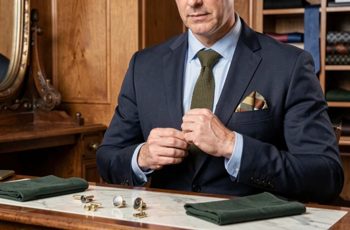
- Green tie (sage, olive, forest) paired with a pocket square incorporating beige or cognac: natural tones enhance each other without producing a garish effect
The color of the suit also plays a role as an arbiter. A charcoal gray suit absorbs bright colors and allows for bolder pocket squares. A navy blue suit, already rich in hue, requires accessories whose palette remains contained.
Tie and pocket square patterns: managing scales to avoid overload
Pairing two patterned pieces is not a problem in itself. The difficulty lies in the scale. Two patterns of the same size (polka dots of the same diameter on the tie and pocket square, for example) create visual confusion. The eye does not know where to settle.
The operational rule is to vary the scale: a wide pattern on the tie (spaced club stripes, large paisley) pairs well with a fine pattern on the pocket square (micro-dots, small checks). The reverse also works. The scale contrast creates a readable visual hierarchy, where the tie remains the main element and the pocket square plays a complementary role.
Striped tie: which pocket square pattern to choose
Stripes are the most common tie pattern. When faced with regimental stripes (diagonal, two or three colors), a pocket square with a discreet geometric pattern (micro-checks, small diamonds) offers a good balance. A striped pocket square is also possible, provided the thickness of the stripes and their orientation differ significantly from those of the tie.
A solid pocket square remains the simplest solution. It rests the eye and allows the tie to take center stage.

Pocket square folding: adapting the shape to the degree of formality
The folding changes the visible surface of the pocket square and, by extension, its impact in the outfit. A straight fold (or presidential fold) reveals only a horizontal band of fabric. This is the most discreet format, suitable for conservative environments where the pocket square should remain a detail, not a central accessory.
Pointed folds (one, two, or three points) increase the visible surface and are better suited for social or creative contexts. They highlight the pattern or texture of the fabric more.
- Flat fold for the office, formal interviews, and classic ceremonies: the pocket square only protrudes a few millimeters
- One-point fold for weddings and dinners: a compromise between sobriety and personality
- Puff fold for casual events: the pocket square is crumpled in a deliberately nonchalant manner, which works well with materials like linen or cotton
The choice of fold also depends on the material. Silk slips and does not hold structured folds well, making it more suitable for the puff fold. Linen and cotton retain sharp folds and are better suited for the presidential format.
The balance between tie and pocket square ultimately hinges on three considerations: material, color, and pattern scale. Each piece must remain individually readable while contributing to a cohesive outfit. When one of these three parameters is already very pronounced on the tie, the other two benefit from remaining neutral on the pocket square.